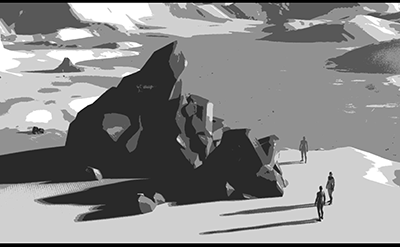
| mulberry plains | ||||||||||||||
|---|---|---|---|---|---|---|---|---|---|---|---|---|---|---|

|
|
|||||||||||||
|
popularity : 57% |
|||||||||||||
alltime top: #9763 |
|
|||||||||||||
|
||||||||||||||
| added on the 2023-07-30 15:30:46 by potati |
||||||||||||||
popularity helper
comments
This succeeded in building an intriquing atmosphere, but I'm not so sure about the rendering style. Still easily worth a thumb up.
rulez added on the 2023-07-30 15:37:01 by break 
Couldn't follow the story, but the artstyle is really cool.
very artistic demo in all black and white, with a very interesting plot
Was so good ! I wanna see many more !
Ok. Not really my cup of tea.
liked the special rendering style and general mood of it
This missed the spot for me.
I liked the attempt at doing something unique, but I thought the execution of the visual effect was too crude.
I liked the attempt at doing something unique, but I thought the execution of the visual effect was too crude.
That's awesome! Very atmospheric.
What an absolutely wonderful trip to a place called home.
excellent athmosphere!
I actually think this was the best demo, it demonstrates great use of technology and constraint (which the winnerdemo didnt).
has some decent composition and nice flow... the posterization filter is a bit crude resulting in noise here and there which is a bummer for the visual effect
I've loved the filter and the mood. Definitively the kind of demos I wanted to see when coming to Evoke.
I love this rendering style.
The audio and visual style caught me. Feels a bit rushed/unfinished towards the end. Still, very nice and different demo.
I dunno, I wanted to like it but it gives off a strong vibe of Animation-Render-Preview.mp4. Was it realtime? I couldn't tell.
beautiful & tasteful, but the ending felt a bit rough indeed
Could perhaps have been interesting with some better rendering in a wild compo, I mean, its just 3d meshes and Unreal, not a proper demo.
I like the visuals, the style and the atmosphere. If it was not done in Epic, I'd consider it should be much higher in the ladder.
I concur!
Very nice! I wish it was longer!
Very enjoyable. What bothered me a bit was less the choice of the 16 color limit, but rather how it was rendered, often making it look more like 4 shades of grey with very large single-color planes. Maybe a different dithering technique or mapping curve could have helped. Still a solid thumb up.
that was fucking cool
Imagine caring whether someone wrote 4000 lines of a graphics API to render a bunch of triangles with a post proc shader or used Unreal :D Graphics APIs are what the demoscene is about!!!
Great
There is potential in this! I liked the scenes and the music, but the posterization effect didn't look very good.
cool visual style, nice presentation, and engaging soundtrack. Nits would be yeah, the postproc is a bit too noisy, the font choice doesn't fit the other visuals at all, and the break was a bit too raw, but those are probably minor complaints. Nice one!
now this was fresh! loved every second of it!
I like the style of this a lot, very cool!
lists containing this prod
submit changes
if this prod is a fake, some info is false or the download link is broken,
do not post about it in the comments, it will get lost.
instead, click here !
