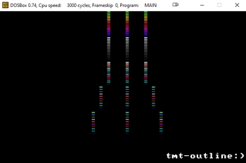
| logotype by Torment [web] | ||||||||||||||
|---|---|---|---|---|---|---|---|---|---|---|---|---|---|---|

|
|
|||||||||||||
|
popularity : 48% |
|||||||||||||
alltime top: #40453 |
|
|||||||||||||
|
||||||||||||||
| added on the 2020-05-24 02:08:46 by spiny |
||||||||||||||
popularity helper
comments
yeah you can save a ton of bytes by e.g. not drawing every segment with its own code which you could invest into colors and a better shape. sure it's not a beauty but one can see what it is right away. and most important: you had fun! so it would be nice to see more from you in the future. don't you wanna have fun? ;)
good ol' motivational thumbs!
good ol' motivational thumbs!
Atari logo in DOS
nice
/|\
submit changes
if this prod is a fake, some info is false or the download link is broken,
do not post about it in the comments, it will get lost.
instead, click here !

my first non Atari assembler and my first 'size'coding :)
Yes, it can probably be smaller, at the very least it has clean exit code (press ESC) that can be binned and the text putter probably takes 20 bytes, but it was fun to do.