|
octave
[nfo]
|
||||||||||||||
|---|---|---|---|---|---|---|---|---|---|---|---|---|---|---|

|
|
|||||||||||||
|
popularity : 53% |
|||||||||||||
alltime top: #19753 |
|
|||||||||||||
|
||||||||||||||
| added on the 2018-08-11 21:43:28 by Spenot |
||||||||||||||
popularity helper
comments
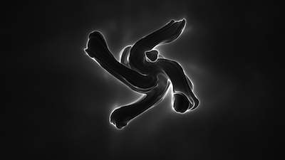
One of the best from the compo, technically simple minimalism. The sound disappoints.
rulez added on the 2018-08-11 22:29:29 by noby 
it has quite some background, which means minimalistic at a burst state.
enjoyed it very much, one of my favs in the 1K compo
enjoyed it very much, one of my favs in the 1K compo
looks very nice! but bytes wasted on the sound might have been better off used on a different way. at least it is not horrible. so piggie for the sound, thumbs up for the visuals :)
Sound would be great without the cuts and just hanging on, changing to offtune and back later. To create an atmosphere.
Looks good, sounds bad. Piggie it is. :)
Nice! I like the sound, I think the steady organ-like sound somehow makes the black background feel like it's full of something.
The visuals have so much potential. A shame there was no design around them to bring this entry to another level. : /
Nice nice!
my favorite in the compo
wow! beatiful!
Cute
This is the inverse of another entry in the same 1k compo. I liked both.
Motivational thumb for a JS 1k with a solid design perspective. Ideally it should have engaged the audience better, with a more coherent soundtrack to that end. So that's what I'd like to see next time.
i like this intro; arty feel ~ memorable & clean
Sweet
okay some objects and a distorted sound
ok
submit changes
if this prod is a fake, some info is false or the download link is broken,
do not post about it in the comments, it will get lost.
instead, click here !
