|
TestRun by Digital Dynamite [web]
[nfo]
|
||||||||||||||
|---|---|---|---|---|---|---|---|---|---|---|---|---|---|---|

|
|
|||||||||||||
|
popularity : 62% |
|||||||||||||
alltime top: #23094 |
|
|||||||||||||
|
||||||||||||||
| added on the 2002-07-14 08:34:54 by BoyC |
||||||||||||||
popularity helper
comments
slow, ugly and linear interpolation, for the camera.
Not bad, but not worth the loooong loading time either IMO. Somewhat boring and pointless. Music was ok for a 64k but I'd still prefer something which actually sounds like goa.
3D flyby with limited textures, minor bugs and no movement whatsoever. At the first scene it seems to crawl too. It has many scenes however but that makes it rather boring. The music is not bad for 64K. In general not bad, but not extraordinary either.
i made thje texture on the table! i made it! oyeah, oyeah... ,) anyway, i think this was the only intro at the patry... :( the other can't be signet as an intro... :| ... ant this is jus a test. and it's finished at the party... :) So, we are very. ;] ... and it was coded in... hehe... not asm... and not C... ;o)
Well, a nice bunch of "real-world" 3d models for 64k. They managed to make scenes like those in full-size demos such as Spot and Kasparov. But as we learned from Adrenaline, 3d modelling alone doth not make a demo. Camera movements are slow, design is nonexistent, and music is stagnant and uninspiring (tho it reminds me a bit of the music from Purple's "Public Demand" intro).
ok scenes, lacks proper texturing, lacks mipmapping, lacks proper keyframing on the camera, as a testrun its ok.. now go and improve :D
For the loading time: Not *that* long, ok for me
But the intro is somehow empty, the scenes are quite far away from looking polished and the used colors are also not the best. I will not directly compare it with Adrenalin. Maybe it's Farbrausch without the perfection, but like in some Farbrausch production it lacks completly the atmosphere
But the intro is somehow empty, the scenes are quite far away from looking polished and the used colors are also not the best. I will not directly compare it with Adrenalin. Maybe it's Farbrausch without the perfection, but like in some Farbrausch production it lacks completly the atmosphere
BoyC, TrX - you two has definitely too much spare time. :)
Good start, do some design, some polishing, and kick our ass at AntiQ 2002.
Good start, do some design, some polishing, and kick our ass at AntiQ 2002.
I'll just thumb up for your next production already, and for the checkerboard!
An intro, that's all. Learn design.
The crowd was clapping to the rhythm of the music at the last scene.
Probably the best hungarian intro of the year.
Probably the best hungarian intro of the year.
The 3d scenes was very pale and slow.
Music and some scene was good.
However, The first 3Dscene is slow...
However, The first 3Dscene is slow...
The tool work has to be quite extreme (in my parameters), but the result is poor. And use your softsynths for something more interesting that quasi-random goa loops.
It's more like a test than an intro. What I miss are *design* (completely!) + dynamic scenes + a softsynth. The music is okay for 10-something kilobytes, but a softsynth would help a lot here. The code is great for sure. You're on the right way DD people!
Best Hungarian intro of the year?? Don't make me laugh. Nice engine, but it's ugly as hell!
improve improve improve. as lenin said.. i fake hehe
too much slow
but nice job anyway
but nice job anyway
glBegin, glEnd, köszönöm szépen, csókolom :)
Nothing just a "testrun". I'm so sorry: if this is the best shot of the year, then its bad for the whole Hungaryan scene. :(
extremely ugly.
ehe... well... this was the very first prod with aDDict. ehe. don't blame the "design" Rigor was extremely drunk during the party, he almost drop out into my PC... :P anyway, the fact that there wasn't any other intro, is not our fault.
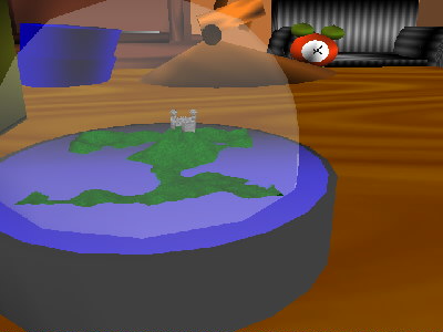
It appears to be the starting point of CNS planet brand (just like whine needs some years in the cellar). Despite the bloody z-buffer wars, linear cam track and quick textures (big respect to BoyC for making it all in soft, anyways), this small scene
history lesson is to my liking.
PS Does Hungarian Parliament really have a duck on a spire up there?
BTW Pascal rulez! ;)
history lesson is to my liking.
PS Does Hungarian Parliament really have a duck on a spire up there?
BTW Pascal rulez! ;)
Ugly as hell, I guess it goes to prove that coders have no eyes or a sense of color :)
kraviz: it's not software, it's opengl :D it's just bloody slow and i know several reasons why - but let's just wait 'till boyc admits them ;)) the camera actually isnt linear but spline, it's just that the spline itself is fucked up (i remember trying to help boyc at the partyplace with that) and no i dont remember the duck when last seeing the parliament :)
Hmm, the multiple loaderbars sucked a bit because they were fooling me. The intro itself wasn't that bad, only slooooooow (as mentioned before).
The Kasparov-spider should've been left out because this intro is far away from playing in one league with K. And the chess field was _so_ 1993... :)
The Kasparov-spider should've been left out because this intro is far away from playing in one league with K. And the chess field was _so_ 1993... :)
gargaj: shit happens ;] (derivative seems to be broken in control points).
Also forgot to mention, I adore the loveley piggies in second scene :O)
Also forgot to mention, I adore the loveley piggies in second scene :O)
NEVER!!!

where's the amiga port???
all is still
ugly and boring. music is not my cup of tea either.
for some reason, I like this very much... the music does create some kind of atmosphere where the 3d floats around sensibly...
good testrun btw
submit changes
if this prod is a fake, some info is false or the download link is broken,
do not post about it in the comments, it will get lost.
instead, click here !
