|
Transplant by Brain Control [web] & Still [web]
[nfo]
|
||||||||||||||
|---|---|---|---|---|---|---|---|---|---|---|---|---|---|---|

|
|
|||||||||||||
|
popularity : 69% |
|||||||||||||
alltime top: #1005 |
|
|||||||||||||
| added on the 2011-12-28 23:46:59 by payne |
||||||||||||||
popularity helper
comments
rulez at large, especially the music
ok
very good prod :)
whoa
Yay!
nice
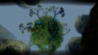
64k demo shock! Thanks for that nice gift shortly before this year ends. Uncovering Static isn't alone on this planet in 2011!
Nice plants!
NOW youre thinking with portals ;)
Rocks nevertheless.
Rocks nevertheless.
Visually tremendous.
very nice!
flyby-ish but well done
I like it.
This is a very good intro, there's a lot of work in it, and a good rendering of L-systems. I also enjoy the synth.
However, it's a bit too uneventful - a flyby with a few simple animations. As good as it is, there's for improvement here. Looking forward seeing your next intro!
However, it's a bit too uneventful - a flyby with a few simple animations. As good as it is, there's for improvement here. Looking forward seeing your next intro!
good
I didn`t contribute anything to this demo, so I am allowed to vote.
Nice one, everything improved compared to Pandora, yes, even the music is better and I have no hard feelings about that. :)
The plants are great!
Nice one, everything improved compared to Pandora, yes, even the music is better and I have no hard feelings about that. :)
The plants are great!
I don't really like the music + the font sucks + what LLB said
otherwise, solid concept+execution, great job
otherwise, solid concept+execution, great job
extremely enjoyable. like growing threes.
hmmm, i really don't like the music, font is ugly and find the composition/direction odd at times (actually the scenes without the green elements sucks and the rest rulez :)
Looks extremely fine, but the sound is not too good.
Great!
fantastic visuals, the music is.... erm... not my cup of tea but overall a solid prod. and thanx for the greetings =)
A truly fantastic intro and the flyby aspect did not bother me at all. One of the products that will save the demo year 2011 for me.
That's a solid prod content wise, and your L-systems look good! Direction could be much better.
so it starts with arial and companion cubes, which made me ready to hate the whole thing, but then the rest was pretty decent, although both the texturing and the texturemapping needs a lot of work. that said, i'm not willing to forgive the arial - if you need a techy font, use something like lucida console, whereas for the "organic" font wrapped in plants, i would've used garamond italic. it would've felt less "bolted on".
I second rasmus for the scenes, music is cool for me.
A good 64k which deserve a thumb.
A good 64k which deserve a thumb.
one of the scene highlights of these last few months. flowers & leaves are ruling the scene!
gargaj the font snob :)
Colors, music and direction are all over the place. It's a good effort, but not memorable at all.
Same old engine, same old shit.
Incredible.
The music, the mood, everything (except Arial!) ;)
The music, the mood, everything (except Arial!) ;)
Looks nice and Mad's music is very cool too. Solid thumb up. :)
well done my freinds
Awesome!
Totally soulless for me.
This was a bit better than latest BC intros. Didn't bore me too much. I love the plant scenes.
Not bad for BC :)
There's some problem with the sound here. The demo is not running that smoothly, but smooth enough to watch but the sound starts to click and lag and repeat or something.
There's some problem with the sound here. The demo is not running that smoothly, but smooth enough to watch but the sound starts to click and lag and repeat or something.
buffer too small or sound loop/thread thing.
it's not bad, and there was a few moments i rather liked (eg. at 2:20), but overall i don't like the aesthetics (read: imho it's ugly)
I know I said on the BBS that one musician who complain about the music of a prod is for sure someone who want to point at his own direction... but really, guys, come on? Music?
nice!
.
This has a lot of beautifully crafted 3D in it with a nice atmosphere and many little things to recognize. I enjoeyd the flight all the way. Deserved to be high-ranked.
A strange mixture of things and as others have said, the plants are really nice to watch.. Kindo of like sped up time lapse photography, more could have been made of this concept I'm sure but it's still really cool.
Is this enough for Smash to make another 64kb ? :)
Everything I like.
nice!
too messy for me
Something for the sustainability board, looks good.
trees - cool, but otherwise muddled and boring
magic: no :)
hey, this is pretty good. a lot better than the previous bc 64ks in that the scenes evolve - it feels less flyby, there's more movement than just the camera and it holds interest a lot better.
but look, the problem for me is it still looks so "seen it all before". probably because it appears to be using all the same techniques for models, textures, shading, even the synth as the big names were using between 5 and 10 years ago, only with a worse director in control (you can get a lot of mileage out of primitives and modifiers when fiver or zoom is in charge).
this is still pretty good, but to make something top of the line in 2011 i think you need to move past the old way of doing things imo - we've seen it before and done better a long time ago.
Some beautiful scenes in there. The trees are a nice twist to the seen-a-million-times industrial/factory setting.
Still the winner for me.
Still the winner for me.
good
Awesome and lots of nice content, Great Show :)
awesome scenes, sometimes a bit boring to watch it twice, but nice one all in all.
This is really cool stuff, but the "pack lots of geometry/textures together" concept feels rather old.
awesome plant scene.
great show.:)
great show.:)
Not a masterpiece, but there is some just brilliant things...
Yeah! HNY!
Yeah! HNY!
Companion Cubes! Where's GLaDOS? ;)
Quite nice.
Good!
WHOA. Releasing such a great 64k is almost a crime!!
You suckers, you are so good in this. Still, I loove your prods :).
You suckers, you are so good in this. Still, I loove your prods :).
Aaaaand yet another awesome prod by Brain Control. \o/
Nice world you create there. Please add a little visual candy the next time, and it will be a rocker.
Very solid 64k, no doubt about that :)
best in the comp IMHO
solid 64k
What smash said
Solid 64k!
Looking forward to see you improve those vegetation generators in your future releases.
Looking forward to see you improve those vegetation generators in your future releases.
Great! Bokeh is the new hypnoglow
Thx for this beautiful trip !
VERY nice (except for the fonts...).
I like the plants :)
Awesome vegetation!
that is just stunning!
Butts were kicked.
Really build up to something in the end.
One word : Beautiful!
For a 64k it's ok. Flybyish design was definitely the worst part of the prod.
there is a lot going on but it feels completely empty for me. only the fact that it is a 64k saves it from a thumb down.
Seems a bit empty for me. It looks like you guys just wanted to stuff into 64k as much as you can and then flyby. Looks great thumbs up.
Cool plants. The scenes seem too dense; they need more air :)
meh
Blühende Landschaften
O_o--b
Very well produced trip !
Nice, but it's like something is missing.
Flat shading on round objects is sometimes annoying.
Flat shading on round objects is sometimes annoying.
Very cool!
awful music.
nice, but i missed a fitting (preferably jungle) track to it.
Lots of quality content!
...................
.
Aweaome content, good flow.
HQ Kkapture MP4 available Here.
HQ Kkapture MP4 available Here.
Failed direction. The demo did absolutely nothing for me despite the technology involved.
Cool
submit changes
if this prod is a fake, some info is false or the download link is broken,
do not post about it in the comments, it will get lost.
instead, click here !
