| Syntax Party 2009 by Warriors of the Wasteland [web] | ||||||||||
|---|---|---|---|---|---|---|---|---|---|---|

|
|
|||||||||
|
popularity : 56% |
|||||||||
alltime top: #11805 |
|
|||||||||
| added on the 2009-08-14 07:22:12 by ript |
||||||||||
popularity helper
comments
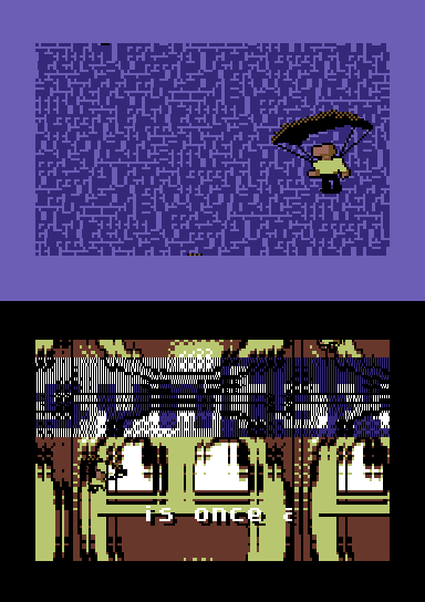
Okay, so I mirrored the file - didn't know whether stealing file links from csdb was kosher or not. Definitely stole the screenshot, though. MUHAHAHAHAHA!
added on the 2009-08-14 07:23:53 by ript 
cool parachuting dudes from the original but a super ugly rotozoomer with those godawful smiley faces that have been plaguing the internet lately
pig cause i like the original invite so much
pig cause i like the original invite so much
great invitation.
I don't know if I really like the rotozoomer. Sure it's fast, but the dithering used with it makes it really messy and the logo and scroller just seem to make it even messier. The parachuting guys are cute though.
I am totally sure that I totally don't like the rotation zoomer, it just doesn't look good. And neither does the logo due to the weird transparency, it looks more like a bug than anything.
Music is very nice though. And the parachuters are still funny. :)
Music is very nice though. And the parachuters are still funny. :)
I like the raw and messed-up look of that rotozoom, the music is swell and the overall package is oozing with data vibes.
You can't eat the ceilling! The intro is very inviting and that was the goal, I guess. The Rotzoomer is fast and that's what counts! YEAH!
not that bad
Ahh yeah, love the feel of this.
Dirty stuff, me likes.
Cool intro, fast fullscreen rotozoom (if not exactly pixel-perfect :). Not a typical C64 production and that's a good thing.
So data. The rotozoomer is totally messy and fast. This is not your grandfather's demo.
Ok, but ripping castlevania is so lame.
xernobyl: The tune participated in The SID Compo V in 2005. Don't really know what's so lame about covering/paraphrasing existing tunes as long as you don't pretend you're original.
good balance between data and dirt
those parachute-dudes looked like a fli-animation. how cool!
very original and cool invitation!
superb! :D
Thanks WoW. Rocking tune choice. Really appreciate you guys doing an oldskool style invite for the party. Come to Syntax, etc....
Good one!
I like the style of recent WOW demos. They have ugly but smooth fullscreen effects in strange messy modes and music tunes I could listen to for ages!
As for the rotozoomer, it seems to use chars what makes it bad. I have seen recent rotozoomers (mostly with very small bitmaps, remember that AEG 4k which introduced the concept) and chessboard rotozoomers which can be made to look like pixel perfect rotozoomers but be really using various versions of precalced chars (I have to think a bit of how). Most of them don't look so awful (even if there are still artifacts). I think this demo used the same technique but with worse results.
As for the rotozoomer, it seems to use chars what makes it bad. I have seen recent rotozoomers (mostly with very small bitmaps, remember that AEG 4k which introduced the concept) and chessboard rotozoomers which can be made to look like pixel perfect rotozoomers but be really using various versions of precalced chars (I have to think a bit of how). Most of them don't look so awful (even if there are still artifacts). I think this demo used the same technique but with worse results.
Me like
submit changes
if this prod is a fake, some info is false or the download link is broken,
do not post about it in the comments, it will get lost.
instead, click here !
