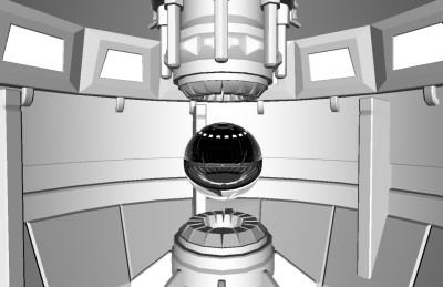
|
PC-03 ON/OFF by Panda Cube [web]
[nfo]
|
||||||||||||||
|---|---|---|---|---|---|---|---|---|---|---|---|---|---|---|

|
|
|||||||||||||
|
popularity : 66% |
|||||||||||||
alltime top: #6771 |
|
|||||||||||||
| added on the 2009-04-13 15:12:37 by stijn |
||||||||||||||
popularity helper
comments
:)
rulez added on the 2009-04-13 15:20:04 by Queen_Luna 
dx10.
dx10.
looks a bit dull, but otherwise a quite enjoyable bunch of demo clichés
Was one of my favorites from the compo. :)
kkapture .8 doesn't like it. :( And my rig isn't setup for a realtime cap in vista yet. :(
Provide a vid, please? :)
kkapture .8 doesn't like it. :( And my rig isn't setup for a realtime cap in vista yet. :(
Provide a vid, please? :)
DX10 needed for a grayscale flyby that looks like it's from the late 90s? 3rd place? What am I missing here?
actually there were a couple of things here i liked but WHAT THE FUCK zooming out of a panda's ass?!
I was really happy seeing this end up so high in the competition.
this was shown first, wasn't it?
First PC demo from a new group (or actually from the C64, first PC release here) and it shows. I was happy too to see it taking some good place. It might be motivating.
If I compare this to another BP09 demos, it is good. Still I miss some post effect and filters, now it is only a good fly by. But I can´t give a piggy to this.
Optimus: Panda Cube != Panda Design
So ugly and annoying. The only decent thing about this is the reflective water.
placed too high in my opinion. nice tune, nice show. would have enjoyed that more with a few more colours and textures.
A demo you can run losless on a greyscale monitor! It seems heavily inspired by the game "Rez" and besides 3D scenes (in grey) it has hardly anything to offer.
Er, wait, this ended up 3rd?
Something cool could probably have been done with the models, but the camera-movement really lacks, and there are no effects to make it more interresting.
What's with the hating on textures btw? :p
Something cool could probably have been done with the models, but the camera-movement really lacks, and there are no effects to make it more interresting.
What's with the hating on textures btw? :p
Great modelling, but it looked like an untextured preview. Add some textures and this will get a strong thumb up.
good first production, i agree 3rd place is a bit too high though.
somehow too sterile for me.. nice attempt anyway
DX10? Vista? What for?...
For a firsttimer, it was OK. But still I miss the colors, post effects and so much more. Keep on going.
As uninspired and bland as they come.
forgot to include data/textures ?
Hmm, not into this at all.
sweet...
DX10, Vista, what for comments: People, people, people.
That's just saying "I don't understand why someone used a particular set of already-made routines so they didn't have to code bare metal."
So don't ask. It doesn't matter.
Me, I liked it. Will I watch it again? Fuck no, I don't use Windows.
That's just saying "I don't understand why someone used a particular set of already-made routines so they didn't have to code bare metal."
So don't ask. It doesn't matter.
Me, I liked it. Will I watch it again? Fuck no, I don't use Windows.
@radiantx: Yes, you are right. I don't know what happen last night and I clicked on the group name and got me to the panda design. Maybe I was drunken :P
Ok,. I know what happened. Someone had wrongly submitted it as a panda design prod that day but now it's corrected :P
iiked most of it
selfvoting .. and lack of textures ..
nice.. And kewl name Panda Cube
wtf? lame, especially from a coder's persective
dull
men i didn't get whatsup with that red ball?
DX10, but looks like DX7. ;)
meh. and dx10. and grey. just about the only thing i liked was the hand-drawn "panda cube" logo at the end, but that's not enough...
"Hi everyone. I would like to add that we're not done with this Demo yet. There will be a final release in 5-6 weeks that will make it look much better. After coding a brand new Framework I only had 2 weeks to finish up the Demo. I actually were finishing up the camera splines at Breakpoint on a borrowed Laptop as my Laptop can't run my Demo :( Also I would like to add that the DX10 was mainly choosen because of the Reactor effect at the end that can in its current state (wave simulation on ikosaeder geo sphere) not be coded on shader model 3. The whole demo was deliberately made in Black/White/Grey but of course the shader could be much nicer ;) Stay tuned for the final version..."
waiting for that.
waiting for that.
why do you have that silly logo I made for my stupid group?
I think alot of "Cool" groups should use DX10 because of the compatibility with hardware. I couldnt run half of the fucking PC releases due to DX9 dependencies.
For example, the 1st place demo from Faillight crashed...
So props for using a 3 years old API instead of a 8 years patchwork.
For example, the 1st place demo from Faillight crashed...
So props for using a 3 years old API instead of a 8 years patchwork.
Never seen this before, it's ok!
I have to thumb this one now because the final version dupe was deleted. Final makes it awesome.
Quite OK for a 1st prod!
cool
.
Good for a first. But it definately needs more textures.
I * love this!!!
submit changes
if this prod is a fake, some info is false or the download link is broken,
do not post about it in the comments, it will get lost.
instead, click here !
