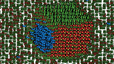
|
Bugtro 2 by Mostly Harmless
[nfo]
|
||||||||||||||
|---|---|---|---|---|---|---|---|---|---|---|---|---|---|---|

|
|
|||||||||||||
|
popularity : 61% |
|||||||||||||
alltime top: #50305 |
|
|||||||||||||
| added on the 2008-03-24 21:23:06 by seρρjο |
||||||||||||||
popularity helper
comments
Первый нахЪ! =)))
rulez added on the 2008-03-24 21:29:43 by RRROAR 
same soundtrack again? The cube at the end was cool
When I saw it on the stream, I thought it was cute & clever, but watching it on my own pc, it's somewhat underwhelming. (I think it's the sprites. They suck.)
same tune and boredom involved.
More like Bugtro 1.25 to be honest.. it should have more new content.
:|
:(
I'd give a thumb up because I like these kiinds of idea and the use of 2d sprites, but yes they look ugly and pixelated and not as fun as in bugtro 1. Bugtro 1 is teh shit!
#1 was fresh this was unfortunately not :(
what datsua said.
piggy for trying
piggy for trying
what LiraNuna said.
Some interesting and fairly original stuff, but overall not very impressive.
not as good as the first one
nothing special
too much recycling..
While I liked the first bugtro I think this one is rather uninspired. Plus, what Preacher said.
sprites in hd. we should be in awe. we're not.
bad rehash of a good idea
CRAPPPPP
what ps said
oh shi впервые вижу что ктот здесь по русски печатает О_о
ok, but not even close to the quality of the first bugtro
not that bad
what ps said.
Loved the first, and it would be fine to have this as a followup - IF it weren't released in a compo. The most dissapointing thing is that the music was reused.
Basically, this makes the first one look less impressive, and I should thumb it down for that. But it doens't COMPLETELY suck.
Basically, this makes the first one look less impressive, and I should thumb it down for that. But it doens't COMPLETELY suck.
what ps said.
if not compared to bugtro 1, it's great :)
what other people probably said or will say.
Beside the obvious reuse of the first bugtro effects and music it doesn't even manage to look as good.
Very bad and not in a funny way.
so-so, what everyone else already said
not much going on here
i've expected a bit more...
So interesting that during watching it I went to kitchen make tea, but AMAZING GARGAJ RESOLUTION SELECTOR ROX HARD!
in general there's nothing to be said against reusing effects, but 90% recycled code, completely recycled music and less than 2000 pixels worth of original graphics :) is a bit much.
Unfortunately this was majorly disappointing. :-( I loved the original bugtro soooooo much.
you should have done that in 4k again ;)
What tomaes said.
Nice idea in the end.
Nice idea in the end.
move on
LOL :(
3rd at bp. pretty good for the time this must have taken.. ;)
totally boring this time
not as great as the prequel, but still
OKish
Quite weak compared to the original, but still entertaining enough
some very nice ideas, but its actually very difficult to spot the "effect" sometimes..
Part one was great, but this is a rather lame sequel
One-trick-pony rides again.
yes
I discovered the first one through comments here, and I agree: Bugtro 1 was way better.
neeeeeeeeeee.
Very, very good. Cube unexpectedly implemented. Why so many non-thumbs up is beyond me. Here one finds time-variable projection-plane topology.
submit changes
if this prod is a fake, some info is false or the download link is broken,
do not post about it in the comments, it will get lost.
instead, click here !
