|
Dreams by eXtrait [web]
[nfo]
|
||||||||||||||
|---|---|---|---|---|---|---|---|---|---|---|---|---|---|---|

|
|
|||||||||||||
|
popularity : 62% |
|||||||||||||
alltime top: #7347 |
|
|||||||||||||
| added on the 2007-09-23 09:30:07 by Pirx |
||||||||||||||
popularity helper
comments
Some scenes are slow on my machine, but I think the intro is fantastic.
rulez added on the 2007-09-23 09:32:13 by Pirx 
pure crap (ugly textures, models, scenes, design and music).
What wie8 said. Sorry.
lots of different scenes, but coherent
Slow and ugly
what AstronautStebo said.
Not as good as chillout but still has some strange ugliness and strange beauty at the same time :)
a bit slow, but ok
not prettiful. unsmooth.
Very slow even on modern hardware, the music was bad in places, precalc seemed to take a long time too for what was actually contained in the intro, total incoherence and did I mention that the music made my ears bleed in places?
So a thumb down then?
Nope, because even with all those bad things, for me this intro still has something I can't put my finger on, and it does have some ideas that I liked, such as the wheat field, I also liked the end screen with the bubbles and grey palette, simple but nice. Maybe the whole demo could have been done with a bit more coherence, so have this thumb up and best wishes for your next things :-)
i like that scene grain field
what shockwave said ...
I don't understand why it's so slow.. the rest is pretending something it is not.
Very slow here ( 8800GTS + Core2Duo + WinXp Sp2).
It has some good parts and some (very) ugly parts. Oh and music... it is bad , sorry.
Piggy for the effort.
It has some good parts and some (very) ugly parts. Oh and music... it is bad , sorry.
Piggy for the effort.
Didn't really like it.. a lot of it felt like some old fantasy game. Some scenes were good though, and I can see a fair bit of work went into it, so no thumb down.
Oh, and its super slow here too, but I'm on a box with a shit video card so that's to be expected :)
Oh, and its super slow here too, but I'm on a box with a shit video card so that's to be expected :)
Lots of content in there. Now that you have that covered, focus a bit more on design and coherency and your next intro will be really great.
Sorry, but I didn't like it, especially the music sucks :/. It's too slow and the radial blur doesn't really fit there. Anyway, I wish there will be another demos / intros from you that I could thumb up!
Hmm why its soo slow, some parts kinda slideshow here, pressed ESC, if there comes a proper version i´ll watch till the end. ;)
Very good for a first intro.
sometimes it's beautiful, sometimes it's so damn slow, sometimes it's really ugly and the music is awful everytime. don't know if I should like or hate it.
Ugly
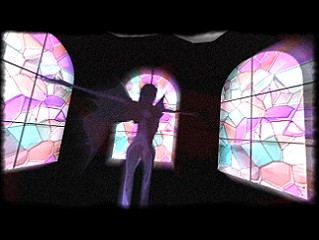
I like the scene that is shown in the screenshot. Runs not bad with my 3 years old graphic card, sometimes a little bit slow. And also the same what r0XX0r said.
Very slow most of the time, music is boring and the visuals range from incredibly ugly to ok. Not really bad but not really good either, too many things to dislike here.
Yep it was a bit too slow there... liked some scenes but it's fairly enough. Can't thumb it up, sry. Improve a bit, it's not far from here to make a blast ;)
in places looks like an ugly copy of fr08. Not sure, why it runs so slow even on decent hardware.
Thumbs up for doing a 64kb. We need more 64kb :) Next time please try to use some reference images or stock pictures to get the colors right.
Thumbs up for doing a 64kb. We need more 64kb :) Next time please try to use some reference images or stock pictures to get the colors right.
Good for first time. Lot of models, scenes. Great work, but the design is few, slow code, and not sync with the music. Guys, will be better next time!
ugly.
what Bery^uf said.
very nice content quantity-wise, although it needs a LOT of polish... props for doing crunchy music (filter your drums though.)
has moments, lost of content. muhic - oh noses, framerate ohnoes!
slow as hell here :\
Anyway really nice music and synth and some sweet ideas, congrats.
Anyway really nice music and synth and some sweet ideas, congrats.
ugly for 2007
What Gargaj said. Maybe go for a concept next time? :)
what boyc said
it's okay !!! ...
what Jailbird said
Bit slow and the music is just bad. Some nice scenes and potential saves it from thumb down.
sluggish on my xp 6600 gt
crashes on my vista 8600 gt
crashes on my vista 8600 gt
We late about a month, but here it is:
The 'final' version
Only the speed is improved. And it has some strange gfx bugs on ATI cards.
Enjoy! :)
The 'final' version
Only the speed is improved. And it has some strange gfx bugs on ATI cards.
Enjoy! :)
Thanks for the final version, cool to watch it again. Only greetings part is slow on my computer.
the most ugly angel i ever saw
The final version is much faster, but still some parts are like 3fps on my 8600gts. On the first viewing it looks just ugly, but once you get past that it's quite well themed. Definitely needs more polishing but otherwise quite good for 64k.
ok models,good effects , AMAZING music !!!
:D
:D
The music is AWESOME! Models and effects too :P
hmmm.. Idea and composition of intro are impressive.. i think very impressive, but unreality of SLOW CODE and again ugly 3d objects...
on my AMD Athlon 3200 XP+ , GeForce 6800 GS 512MB and operative ram about 2Gb this intro show just 2-15 fps !!! WTF? (really sucks)
btw, Crysis on Hgh details (shaders, lighting, shadows, post processing.. all in high) with 800x600+AAx4 on my PC show 28-30 fps :) Think about it ;)
on my AMD Athlon 3200 XP+ , GeForce 6800 GS 512MB and operative ram about 2Gb this intro show just 2-15 fps !!! WTF? (really sucks)
btw, Crysis on Hgh details (shaders, lighting, shadows, post processing.. all in high) with 800x600+AAx4 on my PC show 28-30 fps :) Think about it ;)
cute <3
Some scenes are pretty nice, some are just fugly. Overall, lack of overall design and slow code almost (but not entirely) wrecked it.
submit changes
if this prod is a fake, some info is false or the download link is broken,
do not post about it in the comments, it will get lost.
instead, click here !
