|
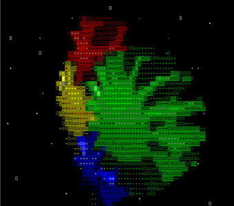
TMDC9 Invitation by Crimson Shine
[nfo]
|
||||||||||
|---|---|---|---|---|---|---|---|---|---|---|

|
|
|||||||||
|
popularity : 61% |
|||||||||
alltime top: #4336 |
|
|||||||||
|
||||||||||
| added on the 2006-10-30 21:19:52 by rale |
||||||||||
popularity helper
comments
nice as usual ;-)
rulez added on the 2006-10-30 21:26:55 by starbuck 
Nice!
I love it.. awesome text effects!!
Great!
pure love ;)
Simply great. I Love txtmode rendering! :)
aah so clean :)
hate the invitro, love the compo. keep it up!
Very cool !
i love textmode demos! but sadly the music is terrible..
hmm yes, while i agree the music wasn't so good, the demo itself rocks, lovely stuff, and still deserves my thumb!
It's ok
OK
Cool stuff.
nice invitation to tmdc once again :)
th.up!
good!
textmode horror!
nice 3d and colors. didn't like the fonts and the music so much.
i like it
as much as i like the textmode rendering ... colours are a bit too bright and text is partially hard to read. even though the music destroys the old-school feeling i enjoyed that most of all. so all an all still thumbup.
I think this compo has nothing to do with "old-school". It's just about textmode. You can use modern effects as much as you want (if you can do them without GPU of course ;)). I don't think using an OpenGL or DirectX textmode renderer would be legal for this compo. Even if it is legal, I would definitely prefer software rendering demos.
Music didn't disturb me much. Invitro rocx!
Music didn't disturb me much. Invitro rocx!
Great music and a good demo! Also a good example of how a moody oldschoolish demo could look like today without beeing another reincarnation of outdated effects beeing badly faked. The graphic-to-textmode mapping is ok, but could have been improved a bit, mainly concerning the appearance of the text messages.
Colorfull textmode 3d, nice presentation and music.
Lovely stuff.
great
Whoa again
nice stuff.
Oh, hell yeah!
thumb up tradition
Ugly colors and font and the music sounds almost like someone's first attempt to use a tracker. Ouch.
Even textmode won't save this, thumbs down for the invitation, thumbs up for TMDC. Hopefully the entries will be better than this.
Even textmode won't save this, thumbs down for the invitation, thumbs up for TMDC. Hopefully the entries will be better than this.
I miss that powerfull music from former TMDC invitations but somehow the invitation feels way more serious than that ones.
actually agree with teel. kinda oldschool the whole demo. but textmode is oldschool anyway. not a suprisingly good text-mode demo. average.
awesome!
really nice!!
Very nice. Nice tune.
I'm just a text mode sick
I don't really get this tradition. TMDC1 was a very good idea (and the invitation was nice as well), but then these folks turned it into another stupid piece of legacy.
What about coming up with some new "alternative ideas" for a while?
What about coming up with some new "alternative ideas" for a while?
This is ok in my book. But what's with the friggin' palette?
Love the music!
Ummh, yeah... too late to have any constructive criticism for big pixel demos :)
+1
shesterenki rulyat! =))))
shesterenki rulyat! =))))
Music was good, graphics were smooth. Not much design, but still enjoyful.
superb objects in here :D
very cool
the real deal.
nice!
submit changes
if this prod is a fake, some info is false or the download link is broken,
do not post about it in the comments, it will get lost.
instead, click here !
