| Deep 90% by Chorus | ||||||||||||||
|---|---|---|---|---|---|---|---|---|---|---|---|---|---|---|

|
|
|||||||||||||
|
popularity : 57% |
|||||||||||||
alltime top: #11328 |
|
|||||||||||||
|
||||||||||||||
| added on the 2006-07-30 10:59:23 by Clarence |
||||||||||||||
popularity helper
comments
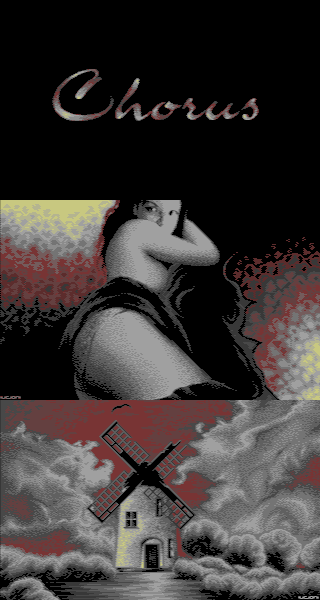
Awesome pictures here. I like the mood and the lyrics as well. And the music fits very well too. Great slideshow!
rulez added on the 2006-07-30 11:55:50 by StingRay 
Some really great pictures here.
some nice pics indeed.
Btw, I've always wondered if there is a technical reason that prevents c64 graphists to make a slightly different dithering on both images which would decrease the "scanline flickering" we usually see. In short why do they do:
11
00
instead of
10
01
Btw, I've always wondered if there is a technical reason that prevents c64 graphists to make a slightly different dithering on both images which would decrease the "scanline flickering" we usually see. In short why do they do:
11
00
instead of
10
01
Some of those pics have an odd photoshop + godot feel to them, while some are clearly brilliant (f.e. the windmill). :)
p01: There are tons of "invented" software gfx modes on c64 and all come with their own stack of funny, wacko limitations. ;)
p01: There are tons of "invented" software gfx modes on c64 and all come with their own stack of funny, wacko limitations. ;)
very nice
you get my thumb
Cool pictures, cool music and a great presentation. What else to expect? I am waiting for the special collector's edition. :) Well done!
I really like Leon style...
p01: Try pixelling in an interlaced mode and see for yourself...
On the C64, that is. Don't forget the interlacing is horizontal, rather than vertical like on i.e. the Amiga.
Lovely.
kitten + skull = sadsié
[optimus_mode]
From what I understand IFLI mode is alternating two 160x200 images (with thick pixels), the second being shifted by a pixel to the left ( or right ), and with a limit of 6 colors ( I guess 4, plus a fixed bg and fg color ) per block of 8x1.
So it allows to dither on a per pixel basis, and not only alternate the scanlines, well with the detail that the pixels of each images partially overlap those of the other image so the dithering could give sthg like :
img1_ _img2 = visual result
2200_ _0022 = 11111
0022_ _2200 = 11111
4422_ _2222 = 23221
2200_ _4400 = 13200
But hey, I've never had a c64 so I might be wrong.
[/optimus_mode]
From what I understand, this is not IFLI anyway. ;)
p01: This is the way I'd like to try interlace on the CPC. In my CPC demo a step beyond, our musician provided two C64 pics with alternate scanlines. In few other CPC demos the same method had been used. I agree that interlace with chessboard-like (how is it called) holes than scanlines, would look better. It does on my CPC experiments (esp in higher res). As for the C64, yep you can flip two pictures so normally the chessboard alternate pixels method might work too, though maybe it's harder for the graphicians? Also there is another interlace mode where you can have one screen and scroll by hardware a half multicolor pixel from it's original position and back to mix the colors. Still, the method you say could work nicely there..
..and the scanline method look very bad in CPC, what I wanted to say threre.
Wow, as this is handmade, a clear thumbs up. My fav also was the skull with cat pic. Eagerly waiting for the final.
tomæs: sure ? it doesn't look like MCI or SHxx. I took some screenshots from Vice, and the images are 160x200 ( with thick pixels ), with the second image shifted by one normal pixel to the right.
Too cheesy for my taste, sorry
It's definitely not IFLI, in any case.
Really nice.
p01: all the pictures in the collections are made in MCI (320x200, interlaced mode with multi color limitations). Actually a screenshot from Vice saves only one frame, and that's why you see the alternate scanlines even if the picture uses traditional 01/10 dithering. If you'll find a way, check out some interlaced pictures on the real hardware, they'll look way different. :)
Considering the collection, I enjoyed it so much! It is deep, emotinal and I could feel that it came right from Leon's heart.
However, I'm not very fond about stealing my greetings idea ! ;)
Considering the collection, I enjoyed it so much! It is deep, emotinal and I could feel that it came right from Leon's heart.
However, I'm not very fond about stealing my greetings idea ! ;)
EEEEEMMOOOOO
(but the color scheme's still okay)
(but the color scheme's still okay)
great gfxs and cool music.
great presentation
ok, but not my kinda prod =p
rulez.
1 person = idiot
submit changes
if this prod is a fake, some info is false or the download link is broken,
do not post about it in the comments, it will get lost.
instead, click here !
