|
harmoony by Lithe Lewd Leyman
[nfo]
|
||||||||||||||
|---|---|---|---|---|---|---|---|---|---|---|---|---|---|---|

|
|
|||||||||||||
|
popularity : 56% |
|||||||||||||
alltime top: #18631 |
|
|||||||||||||
| added on the 2001-05-20 21:24:30 by crs |
||||||||||||||
popularity helper
comments
i english speak can <g>.
added on the 2001-05-24 03:02:50 by _ 
why the dirty/noise effect? without this efect the design and style of the intro can be better.. the music is poor..
This is not noise, but an 'old movie'-effect, which you can also see in several kolor-productions.
However, it's rather good. Like a mixture of older kolor and older unik stuff. The music fits, although the piano sample could have been better.
However, it's rather good. Like a mixture of older kolor and older unik stuff. The music fits, although the piano sample could have been better.
design is boring
cool . clean. minimalistic.
(and bit boring)
(and bit boring)
stylish and different
not bad, but not good either.
i liked the noise-effekt; but would be better with a more unregular point distribution
and hey, even some 4k intros have much more complicated music...!
i liked the noise-effekt; but would be better with a more unregular point distribution
and hey, even some 4k intros have much more complicated music...!
a little b/w magic
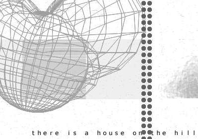
The result of harmoony is predictible from its very first scene. Like the three independant, separated cubes it displays, the visuals, the music and the text feel totally disconnected. We have well implemented abstract scenes, with multiple things happening at the same time. We have a storytelling text that seems to talk with itself since it cannot do so with the visuals or music. We have almost inexistant music, consisting of a few notes of piano.
Nice calm intro
this is really calm..
submit changes
if this prod is a fake, some info is false or the download link is broken,
do not post about it in the comments, it will get lost.
instead, click here !
