|
Code Red by SquoQuo [web]
[nfo]
|
||||||||||||||
|---|---|---|---|---|---|---|---|---|---|---|---|---|---|---|

|
|
|||||||||||||
|
popularity : 63% |
|||||||||||||
alltime top: #7675 |
|
|||||||||||||
|
||||||||||||||
| added on the 2004-03-01 09:42:48 by toxie |
||||||||||||||
popularity helper
comments
cool one. also liked the music alot.
but dienstaelteste crew makes tippfehler ;)
but dienstaelteste crew makes tippfehler ;)
Yes !!! The music is excellent and overall the demo is very pleasant to look at. I like it ...
The ambiance of the demo is really coool :)
The ambiance of the demo is really coool :)
strange & mystic, not enough action for me
very nice production
well... to slow, poor design... only the music is nice
sorry...but spengler said. slow and boring
Great atmosphere!
That was seriously fucked up. I ran it in a window, and whenever the brightness/colour/whatever settings changed in the demo, my whole desktop changed to match... so it was almost like the whole desktop became part of the demo!
Also, most parts had a lot of red, including the screenshot part which looks like it should be grey... But the red looked pretty good, and its called code red so maybe it should be like that???
Also, most parts had a lot of red, including the screenshot part which looks like it should be grey... But the red looked pretty good, and its called code red so maybe it should be like that???
I thought it was a boring and aimless demo, very badly designed with a dreadful colour scheme and I found the music lacking in any melody or character.
Not to my tastes at all.
Not to my tastes at all.
YAWN!!!
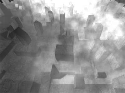
This one probably finished first because there was no other challenger. I like it anyway. Strange atmosphere. Black-red colors fighting with grey. A phantom city hidden behind the clouds. Is it the end of the world? Perhaps the worthy continuation of Halcyon_chimera. Big big thumb.
This is how Chimera should've been done. :)
I agree with Psonice tho', whatever it was, it fucked up the desktop (looked like a palrot(?):)
I agree with Psonice tho', whatever it was, it fucked up the desktop (looked like a palrot(?):)
fucks up the screen pretty well when in windowed mode :D (me likes) ... it's kinda slow, though... and the title kinda sux ;P
I like the alzheimer group style, and Genetic Geminis music just rocks. But pleeeeease add 1280 resolution...
Wherever you found these design-pills, be sure to take them more often. Nice colours and scenes and even fitting to the music. Rockt.
maybe i will remove the windowed checkbox for the final version
don't you dare to do so, mister!!! :)
instead, fix that sorry looking "human" :)
don't you dare to do so, mister!!! :)
instead, fix that sorry looking "human" :)
really nice prod ... finally something original again.
i am really anoyed by the current trend of "redoing stuff other people have done before" - so this prod actually is a really welcome and well done exchange ...
i am really anoyed by the current trend of "redoing stuff other people have done before" - so this prod actually is a really welcome and well done exchange ...
Hopper my experience of gammaramping is that it works differently in newer drivers from example nVidia than the old ones.. On some cards :D
The problem is that the new ones doesnt let you change gammaramp 100% just modify it a bit.. Something like those 16bits per color component you choose acctually is only worth 3 or something..
Anyways, the demo is quite nice, cant really see the "new" stuff as q has found tho, and it has quite some flaws..
pigface
Heck, I'll give this one thumbs up alone for significant improvement over the previous SquoQuo releases. Sure it has many flaws, like the visuals look mostly good but when there's not enough blur from time to time we can see the truth behind the scenes. :)
Still, very well built atmosphere, good music and cool gamma ramping (that'll get probably overused during the next year so that everybody's going to be fed up with it before summer ends).
Still, very well built atmosphere, good music and cool gamma ramping (that'll get probably overused during the next year so that everybody's going to be fed up with it before summer ends).
A bit boring but overall a good look and feel. Not enough for a thumb though....
Definitely above average. Almost gets a thumb
ZZZZZZZZZZZZZZZZZZZZZZZZZZZZZZZZZZZZZZZZZZZZZZZZZZZZZ
the zik is OK but squoquo's mansion is way better... two minutes of boring 2-D effects followed by some flythrough of an orthogonal city thing, then a bunch of this guy with his arms outstretched, then the typical wierd virus/tentacle monster shaped things spinning around.
WTF!!! YOU GUYS CAN DO SO MUCH BETTER!!!
yeah! this one has great atmosphere... and great music..
I'll give SquoQuo credit for always trying something a little different in the coding arena. However, like many (all?) of their productions the visuals look very, um, amateurish. Poor colour choice and stuff...
kinda dull.....
Almost thumbed it down, But the time and effort and Cool musik made me turn the hand.
damn sexy demo
The atmosphere is great, but sadly it looks buggy here. Even with gamma set to 0.5 the greetings are mostly white on white.
boring..
ok
Soundtrack builds great atmosphere and visuals try to follow it with good results.
pretty interesting, especially on windowed mode
submit changes
if this prod is a fake, some info is false or the download link is broken,
do not post about it in the comments, it will get lost.
instead, click here !

no really: i love the style and the atmosphere of the demo..