|
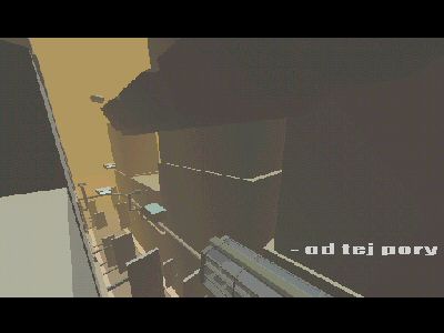
Fig 9 by Ultimaa
[nfo]
|
||||||||||||||
|---|---|---|---|---|---|---|---|---|---|---|---|---|---|---|

|
|
|||||||||||||
|
popularity : 57% |
|||||||||||||
alltime top: #16918 |
|
|||||||||||||
| added on the 2004-01-09 02:52:31 by legalize |
||||||||||||||
popularity helper
comments
ok, it's typography sucks, it could've been prettier, it takes too long, but i was pleasantly surprised by the little cool details that appear here and there :)
rulez added on the 2004-01-09 08:16:54 by superplek 
your scientists invented flatshading :)
long, and ugly sometimes, but has its charm...
maybe it has something to do with the fact i didn't understand a word ?
long, and ugly sometimes, but has its charm...
maybe it has something to do with the fact i didn't understand a word ?
yep
The fonts were ugly, and not using english sucked, but well, it had it's nice details here and there. Btw, the chippy track sucked too :P What the heck, let's thumb up :)
and all this, in 60 kbs only !!!
the part where the robo-arm puts a crate into the monorail-vehicle is super 'cute' :)
music and font suck my big toe but I can't fault futuristic cities, esspecially this one.
The music is horrible.
long, ugly and the music sucks
all your box are belong to us
Plain jane, and not just because it's all flat-shaded.
No bad at all, but...
...you can set the video mode to an highter resolution like 800x600 or use multisampling filter to antiasing a bit the visuals
...you can antialiasing to font and write it in a diferent language like english. It's more understandable
...the sound engine (maybe a tipical softsynth) is not bad, but you can, one more time, add some filters and make the sound much bether
you have done this prod in 60928 bytes (you can compress them a bit more to fill it in 58kb) and you CAN make all of these features without problems.
Next time, you can make it betther guys! :)
music is bleh
Fun and quite nice to watch. I liked it.
What pk said.
hope to see some more stuff from you guys.
reminds me abit about unik and bypass. you should improve on the musical part though.
reminds me abit about unik and bypass. you should improve on the musical part though.
submit changes
if this prod is a fake, some info is false or the download link is broken,
do not post about it in the comments, it will get lost.
instead, click here !
