|
NQ4K by Aesrude
[nfo]
|
||||||||||||||
|---|---|---|---|---|---|---|---|---|---|---|---|---|---|---|

|
|
|||||||||||||
|
popularity : 56% |
|||||||||||||
alltime top: #12048 |
|
|||||||||||||
|
||||||||||||||
| added on the 2014-01-06 08:37:29 by nightlord |
||||||||||||||
popularity helper
comments
Wow. Really stylish work. Congratulations.
rulez added on the 2014-01-06 08:55:31 by Hydrogen 
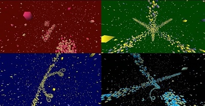
Is ok. Interesting concept, but I think a bit more could have been done with the shapes and things. Music didn't really seem to connect very well with the visuals either.
It remind me of another Nightlord title, mist / civitas (mist text dots effect). But this time in 3d, in 4k, on another platform. Ok, maybe it's just me. :)
Even if music in 4ks might be normal these days I would have liked it more without music and more design with the remaining bytes. But still worth a motivational thumb up :)
Except from the horrible choice of colours this has a great atmosphere!
Better sound required.
Even if simple cubes with projection distortion, was nice enough and feelingful music.
Coder colors and weak synth.. nevertheless it's a good start!
nice one
this is pretty ok for a firstie.
and dont worry, your "weak synth" will grow into sth mature if you keep fiddling on it.
now learn some shader-magic so your cubes look a bit better; or go the way of raymarching directly while you are at it already. ;)
and dont worry, your "weak synth" will grow into sth mature if you keep fiddling on it.
now learn some shader-magic so your cubes look a bit better; or go the way of raymarching directly while you are at it already. ;)
first 4k
Looks vert werkkzeug-ish, but stil a thumb up, mainly due to the harsh green background at a certain point whcih I thought was amusing enough to thumb it up. Some cubes and a synth, well. Getting there!
I like this one.
submit changes
if this prod is a fake, some info is false or the download link is broken,
do not post about it in the comments, it will get lost.
instead, click here !
